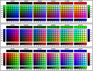
 I’m not going to go into an art lesson and teach you what colors work together or what emotions certain colors promote, but I do want to make certain that one takes in the human aspects of color selection for their viewing public. There are many examples of websites where colors and fonts are all over the place, which results in a site visitor’s instinctive response to flee by hitting the [back] button. We create a website for a reason, to get a message across, to share our interests, to promote services or products. It is important, then, to ensure we get this message across by making sensible decisions when it comes to the use of color.
It is certainly worthwhile to research color selection from a creative perspective but it is equally important to ensure that, once we have decided on a color palette, that it works for everyone. What do I mean by this? There is a significant percentage of the population, somewhere around five percent, that don’t see colors the way the majority of the population does. That is, a variety of color vision issues exists amongst our viewing public. So, what can one do about this? Well, there are two sites in particular that I think are worth noting and that can help you ensure your website is presentable to all.
Vischeck
The first site is Vischeck. In particular, this site has a tool [updated Jul 11, 2015 – URL no longer appears to be active] available where you can specify a particular web page, click the [run vischeck!] button and follow the resulting links to what the specified web page would look like to someone who has one of three different types of color blindness. I’d also recommend poking around this site to learn more about color vision issues.
Luminosity
Another aspect of color selection is the contrast between colors. In order to make a page generally readable, it is important that the contrast between any background and foreground color is sufficient enough that everyone can see and read the content you are presenting. There are times when one might feel that two colors work well together when, in fact, the contrast may actually not be great enough to present a pleasing and readable site. What to do…. Well, what I would do is use the Luminosity Colour Contrast Ratio Analyser tool. With this tool you simply specify two colors, click the [calculate luminosity contrast ratio] button and see how your colors stack up.
Obviously there are many aspects of website design, but keeping in mind that you may be leaving out some of the people who can benefit from your message if certain basic color selection steps aren’t taken, is an issue easily handled.

Pingback: How Does Your Website Stack Up - Part 1: User Interface Standards | WEBphysiology